Why Are My Photos Rejected When They Sell on Other Sites?

- Lauren Sanderson
- April 29, 2019
- read
A question we receive on a regular basis is why are my photos rejected on PhotoDune when they sell on other sites? In this article, our Envato Photography Specialist, Gaby will explore why this happens and why it is important to know.
The answer is that back in 2011, PhotoDune launched using similar standards to the other big players in the industry. In the last 2 years, we have significantly moved away from many of the traditional stock clichés to refocus on content that looks more genuine and to which customers can more easily relate to.
Though the transformation is not complete, we continue to aim towards a different product from most other stock agencies. It does not mean one is right and one is wrong, simply that we are no longer looking for the same type of content.
For years customers have been requesting better curated libraries and based on sales and surveys since we made the changes, our current offer does much better at answering this demand. Elements has also seen its number of subscribers grow each month since launch.
For that reason, a rejection isn’t automatically an indication of low quality or even that it has limited commercial utility, simply that it’s no longer in line with the visual direction we are taking.
Though you will still find some content in our library that doesn’t quite meet those new standards, we are constantly curating to make sure the offer keeps improving so that customers can quickly and easily find relevant and high quality results.
Here are examples of the type of content we are looking for and why:

It can be challenging to produce authentic looking portraits. More so when the model is looking at the camera, as it often has a tendency to feel staged. In this example, the portrait feels very candid. Natural facial expression combined to natural looking lighting, short depth of field and natural processing, simply results in an effective, sincere father/child portrait.

It doesn’t always have to be very complex either. Here, the scene is fairly simple, yet the orange accents add an interesting dynamic to a nicely structured composition. With lovely lighting and as the scene is level, every aspect results in a nice, useful interior shot.
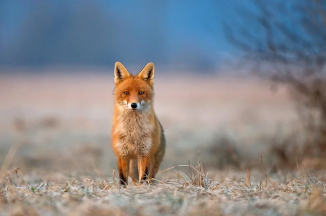
Here, we have another simple and effective composition supported by the short depth of field that helps draw our attention to the main subject. The author has made good use of complementary colors (the warm colors of the fox against the cooler tones of the background). The real environment, use of good lighting and copy space all works really well.
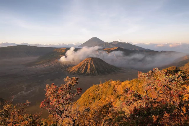
We receive a lot of mountainscapes and they are often inflicted with random composition and harsh midday lighting or overprocessing. Here, the author chose the perfect time (when the sun was lower and light softer/warmer) and used a classic composition (rule of thirds). Processing is still fairly natural – simply beautiful.
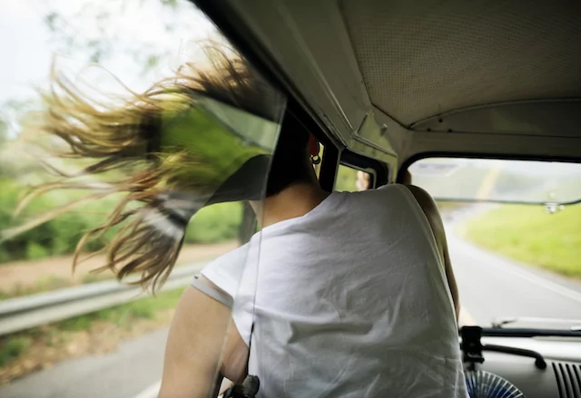
Here is a good happiness/liberty concept. The creative perspective places the spectator inside the vehicle. Lighting is natural and there is a short depth of field, yet we can still see the open road, the hair in the wind – everything about the image screams summer, vacation and road trip!
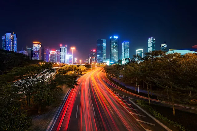
Night photography can also provide a fresh perspective on common scenes/subjects. In this case, the author used a long exposure to capture the motion from the cars, resulting in a very dynamic and colorful image. The streaks of bright colors draws our attention to the city. The same scene shot at noon on a sunny day, would have had a much less pleasing result.
We invite you to view more examples of the type of content we are looking for in our Envato Pinterest Lookbook. We also recommend reading this article outlining the top 5 rejection reasons in photos!